#04 | Data Visualization in Python
Learn how to create awesome data visualizations using the most popular Python libraries, such as matplotlib, seaborn and plotly.
Possibilities
Look at the following example as an aspiration you can achieve if you fully understand and replicate this whole tutorial with your data.
Let's load a dataset that contains information from countries (rows) considering socio-demographic and economic variables (columns).
import plotly.express as px

df_countries = px.data.gapminder()
df_countries

Python contains 3 main libraries for Data Visualization:
Matplotlib (Mathematical Plotting)
Seaborn (High-Level based on Matplotlib)
Plotly (Animated Plots)
I love plotly because the Visualizations are interactive; you may hover the mouse over the points to get information from them:
df_countries_2007 = df_countries.query('year == 2007')

px.scatter(data_frame=df_countries_2007, x='gdpPercap', y='lifeExp',
           color='continent', hover_name='country', size='pop')
You can even animate the plots with a simple parameter. Click on play ↓
PS: The following example is taken from the official plotly library website:
px.scatter(df_countries, x="gdpPercap", y="lifeExp", animation_frame="year", animation_group="country",
           size="pop", color="continent", hover_name="country",
           log_x=True, size_max=55, range_x=[100,100000], range_y=[25,90])
In this article, we'll dig into the details of Data Visualization in Python to build up the required knowledge and develop awesome visualizations like the ones we saw before.
Matplotlib
Matplotlib is a library used for Data Visualization.
We use the sublibrary (module) pyplot from matplotlib library to access the functions.
import matplotlib.pyplot as plt
Let's make a bar plot:
plt.bar(x=['Real Madrid', 'Barcelona', 'Bayern Munich'],
       height=[14, 5, 6]);

We could have also done a point plot:
plt.scatter(x=['Real Madrid', 'Barcelona', 'Bayern Munich'],
            y=[14, 5, 6]);
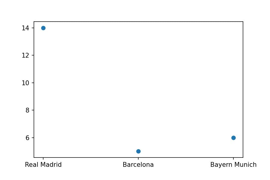
But it doesn't make sense with the data we have represented.
Visualize DataFrame
Let's create a DataFrame:
teams = ['Real Madrid', 'Barcelona', 'Bayern Munich']
uefa_champions = [14, 5, 6]

import pandas as pd

df_champions = pd.DataFrame(data={'Team': teams,
                   'UEFA Champions': uefa_champions})
df_champions
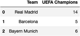
And visualize it using:
Matplotlib functions
plt.bar(x=df_champions['Team'],
        height=df_champions['UEFA Champions']);
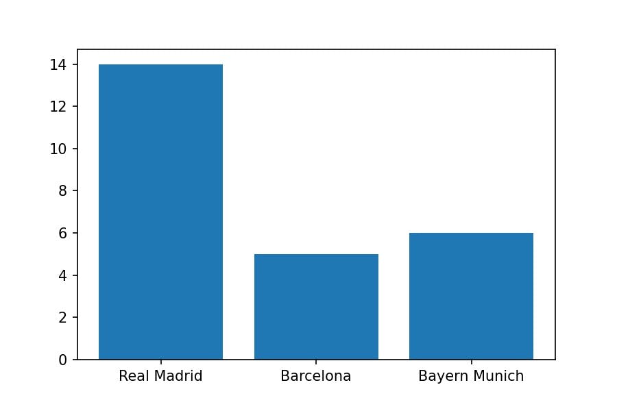
DataFrame functions
df_champions.plot.bar(x='Team', y='UEFA Champions');
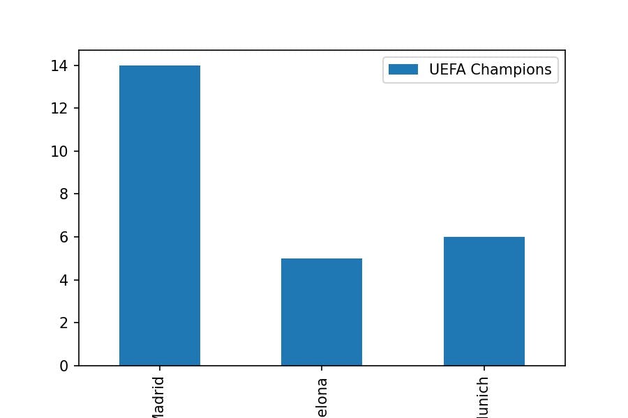
Seaborn
Let's read another dataset: the Football Premier League classification for 2021/2022.
df_premier = pd.read_excel(io='../data/premier_league.xlsx')
df_premier
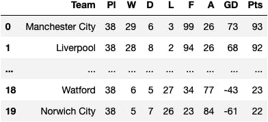
We will visualize a point plot, from now own scatter plot to check if there is a relationship between the number of goals scored F versus the Points Pts.
import seaborn as sns

sns.scatterplot(x='F', y='Pts', data=df_premier);
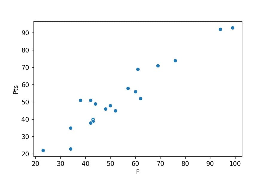
Can we do the same plot with matplotlib plt library?
plt.scatter(x='F', y='Pts', data=df_premier);
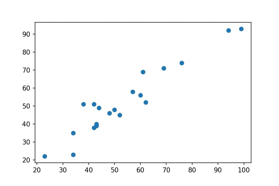
Which are the differences between them?
The points:
matplotlibpoints are bigger thanseabornonesThe axis labels:
matplotlibaxis labels are non-existent, whereasseabornplaces the names of the columns
From which library do the previous functions return the objects?
seaborn_plot = sns.scatterplot(x='F', y='Pts', data=df_premier);

matplotlib_plot = plt.scatter(x='F', y='Pts', data=df_premier);

type(seaborn_plot)
matplotlib.axes._subplots.AxesSubplot
type(matplotlib_plot)
matplotlib.collections.PathCollection
Why does seaborn returns a matplotlib object?
Quoted from the seaborn official website:
Seaborn is a Python data visualization library based on matplotlib. It provides a high-level* interface for drawing attractive and informative statistical graphics.
*High-level means the communication between humans and the computer is easier to understand than low-level communication, which goes through 0s and 1s.
Could you place the names of the teams in the points?
plt.scatter(x='F', y='Pts', data=df_premier)

for idx, data in df_premier.iterrows():
    plt.text(x=data['F'], y=data['Pts'], s=data['Team'])
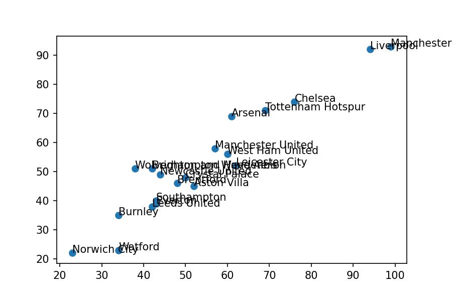
It isn't straightforward.
Is there an easier way?
Yes, you may use an interactive plot with plotly library and display the name of the Team as you hover the mouse on a point.
Plotly
We use the express module within plotly library to access the functions of the plots:
import plotly.express as px

px.scatter(data_frame=df_premier, x='F', y='Pts', hover_name='Team')
Learn how to become an independent Data Analyist programmer who knows how to extract meaningful insights from Data Visualizations.
Types of Plots
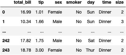
Let's read another dataset: the sociological data of clients in a restaurant.
df_tips = sns.load_dataset(name='tips')
df_tips
One Column
Categorical Column
df_tips.sex
0 Female 1 Male ...
242 Male 243 Female Name: sex, Length: 244, dtype: category Categories (2, object): ['Male', 'Female']
We need to summarise the data first; we count how many Female and Male people are in the dataset.
df_tips.sex.value_counts()
Male 157 Female 87 Name: sex, dtype: int64
sr_sex = df_tips.sex.value_counts()
Barplot
Let's place bars equal to the number of people from each gender:
px.bar(x=sr_sex.index, y=sr_sex.values)
We can also colour the bars based on the category:
px.bar(x=sr_sex.index, y=sr_sex.values, color=sr_sex.index)
Pie plot
Let's put the same data into a pie plot:
px.pie(names=sr_sex.index, values=sr_sex.values, color=sr_sex.index)
Numerical Column
df_tips.total_bill
0 16.99 1 10.34 ...
242 17.82 243 18.78 Name: total_bill, Length: 244, dtype: float64
Histogram
Instead of observing the numbers, we can visualize the distribution of the bills in a histogram.
We can observe that most people pay between 10 and 20 dollars. Whereas a few are between 40 and 50.
px.histogram(x=df_tips.total_bill)
We can also create a boxplot where the limits of the boxes indicate the 1st and 3rd quartiles.
The 1st quartile is 13.325, and the 3rd quartile is 24.175. Therefore, 50% of people were billed an amount between these limits.
Boxplot
px.box(x=df_tips.total_bill)
Two Columns
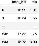
df_tips[['total_bill', 'tip']]
Numerical & Numerical
We use a scatter plot to see if a relationship exists between two numerical variables.
Do the points go up as you move the eyes from left to right?
As you may observe in the following plot: the higher the amount of the bill, the higher the tip the clients leave for the staff.
px.scatter(x='total_bill', y='tip', data_frame=df_tips)
Another type of visualization for 2 continuous variables:
px.density_contour(x='total_bill', y='tip', data_frame=df_tips)
Numerical & Categorical
df_tips[['day', 'total_bill']]
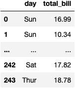
We can summarise the data around how much revenue was generated in each day of the week.
df_tips.groupby('day').total_bill.sum()
day Thur 1096.33 Fri 325.88 Sat 1778.40 Sun 1627.16 Name: total_bill, dtype: float64
sr_days = df_tips.groupby('day').total_bill.sum()
We can observe that Saturday is the most profitable day as people have spent more money.
px.bar(x=sr_days.index, y=sr_days.values)
px.bar(x=sr_days.index, y=sr_days.values, color=sr_days.index)
Categorical & Categorical
df_tips[['day', 'size']]
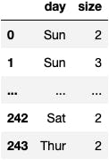
Which combination of day-size is the most frequent table you can observe in the restaurant?
The following plot shows that Saturdays with 2 people at the table is the most common phenomenon at the restaurant.
They could create an advertisement that targets couples to have dinner on Saturdays and make more money.
px.density_heatmap(x='day', y='size', data_frame=df_tips)
Awesome Plots
The following examples are taken directly from plotly.
df_gapminder = px.data.gapminder()
px.scatter_geo(df_gapminder, locations="iso_alpha", color="continent", #!
                     hover_name="country", size="pop",
                     animation_frame="year",
                     projection="natural earth")
import plotly.express as px

df = px.data.election()
geojson = px.data.election_geojson()

fig = px.choropleth_mapbox(df, geojson=geojson, color="Bergeron",
                           locations="district", featureidkey="properties.district",
                           center={"lat": 45.5517, "lon": -73.7073},
                           mapbox_style="carto-positron", zoom=9)
fig.update_layout(margin={"r":0,"t":0,"l":0,"b":0})
import plotly.express as px

df = px.data.election()
geojson = px.data.election_geojson()

fig = px.choropleth_mapbox(df, geojson=geojson, color="winner",
                           locations="district", featureidkey="properties.district",
                           center={"lat": 45.5517, "lon": -73.7073},
                           mapbox_style="carto-positron", zoom=9)
fig.update_layout(margin={"r":0,"t":0,"l":0,"b":0})
